U Vision Group: Multi-Clinic System

U Vision Group: Multi-Clinic System

I worked with U Vision Group to redesign and unify their 8-clinic digital ecosystem. With existing sites scattered across different visual styles and navigation structures, the goal was to build a standardized design system that simplified clinical information and improved the appointment booking experience for patients.

I worked with U Vision Group to redesign and unify their 8-clinic digital ecosystem. With existing sites scattered across different visual styles and navigation structures, the goal was to build a standardized design system that simplified clinical information and improved the appointment booking experience for patients.

Client

U Vision Group

Role

Product Designer

Team

UVG Marketing Team

Timeline

Sept 2025 - Jan 2026

Skills

UX/UI Design

OVERVIEW

5 Clinics, 8 Websites, 1 Designer

5 Clinics, 8 Websites, 1 Designer

Over 18 weeks, I led the end-to-end UX/UI redesign as the sole designer, collaborating with the client and their marketing team to consolidate and modernize their digital ecosystem.

Research

Understanding the issues with the current site, user needs and the existing market.

Development

Prototyping and iterating the product with the support of client feedback.

Review

Revising the product to accommodate new information and fix errors.

THE PROBLEM

The existing company sites are fragmented with disjointed branding and complex navigation.

The existing company sites are fragmented with disjointed branding and complex navigation.

How might we consolidate 8 distinct clinic sub-brands into a unified digital ecosystem that reduces visual friction and guides patients seamlessly to appointment booking?

RESEARCH

Pain Points
Buried Information

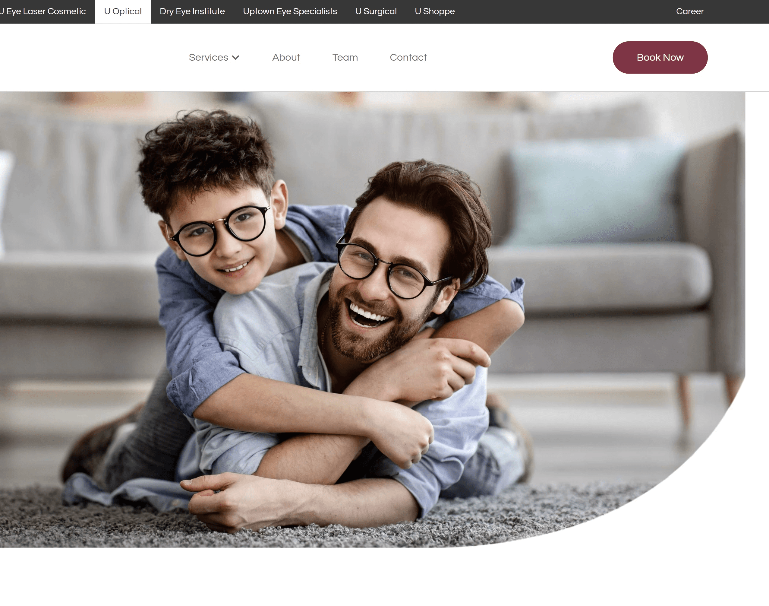
Generic stock imagery and oversized hero banners displace primary clinical details and push key booking CTAs below the fold.

Readability

Dense, unformatted blocks of medical text with tight line heights increase cognitive load for patients seeking quick answers.

Consistency

Inconsistent layouts and fragmented navigation patterns break visual cohesion across different sub-location domains.

THE SOLUTION

A unified digital ecosystem built for clarity, navigation, and conversion.

A unified digital ecosystem built for clarity, navigation, and conversion.

I established a scalable UI component library, standardized navigation patterns, and clear clinical information hierarchy across all 8 sub-brand domains to streamline patient booking.

Systemic Brand & Navigation Standardization

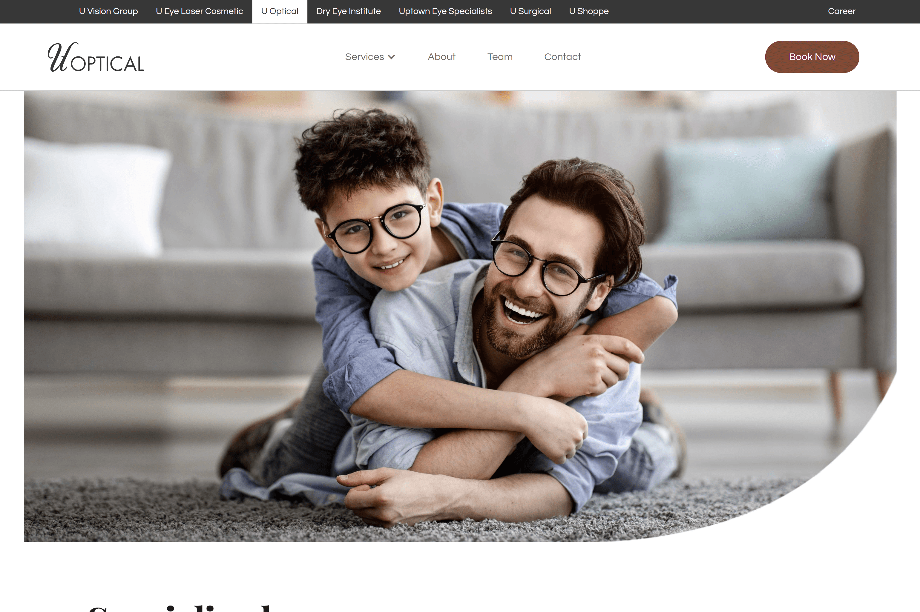
To eliminate visual fragmentation across 8 sub-domains, I standardized core UI patterns into a modular component library. This establishes strict layout grids, uniform navigation behavior, and consistent typography across every clinic location.

Style Guide

I built a centralized UI kit around the existing brand identity by standardizing current colors and fonts while introducing accessible color tokens, type scales, and interactive states to keep every sub-site consistent.

Clear & Accessible Information

I restructured dense clinical content into scannable visual hierarchies, making it effortless for patients to evaluate services, credentials, and treatments.

Restructuring clinic articles and service pages into scannable, accessible content layouts to reduce cognitive load and help patients find key information fast.

Clear hierarchy

Establishing distinct heading levels, structured sub-headers, and generous line spacing allows users to scan complex medical procedures quickly.

Standardized type scales and high-contrast headings create an immediate visual order, helping patients digest complex terms quickly.

Establishing distinct heading levels, structured sub-headers, and generous line spacing allows users to scan complex medical procedures quickly.

Structured Sections

Grouping service details into modular container cards reduces cognitive overload and improves mobile screen scannability.

Replaced walls of text with bite-sized modules and quick summaries to improve readability on all screen sizes.

Grouping service details into modular container cards reduces cognitive overload and improves mobile screen scannability.

Booking Experience

Previously, the Book Now CTA directed users to a separate Calendly page, taking them away from the clinic website with little context about the consultation. I redesigned the scheduling flow to directly connect each clinic location with dedicated, frictionless booking forms.

Full Experience Walkthrough

Use the tabs below to walk through the main flows, from landing on a site to picking a specialist and booking a consultation across the clinic ecosystem.

Impact

We wanted to ensure Mosaiic could create a sense of community and belonging among users.

Provides clear and accessible clinical information for patients.

Provides clear and accessible clinical information for patients.

Provides clear and accessible clinical information for patients.

Unifies 8 separate clinic sites under one cohesive visual identity.

Unifies 8 separate clinic sites under one cohesive visual identity.

Reduces drop-off rates by replacing external scheduling redirects.

Reduces drop-off rates by replacing external scheduling redirects.

REFLECTION

Key Takeaways

Working with U Vision Group and their marketing team was a great learning experience. It helped me sharpen how I communicate with stakeholders, manage real-world deadlines, and align design decisions directly with client expectations.

Working with U Vision Group and their marketing team was a solid learning experience. It helped me sharpen how I communicate with stakeholders, manage real-world deadlines, and align design decisions directly with client expectations.

Real world projects evolve

Launching all 8 sites live was a huge milestone. When the client later pivoted to WordPress to bring in a vast amount of new information, it was a solid reminder that shipping a clean design system is only half the job. What really matters is whether that system can flex as a client's information needs expand after handoff.

Launching all 8 sites live was a huge milestone. When the client later pivoted to WordPress to bring in a vast amount of new information, it was a solid reminder that shipping a clean design system is only half the job. What really matters is whether that system can flex as a client's information needs expand after handoff.

Constraints drive better decisions

Working within company constraints forced me to be much more intentional with my decisions, finding the sweet spot between what the client needed and what made for great UI. Navigating those boundaries made me a sharper problem solver, teaching me how to craft smart trade-offs when standard design patterns wouldn't fit.

Working within company constraints forced me to be much more intentional with my decisions, finding the sweet spot between what the client needed and what made for great UI. Navigating those boundaries made me a sharper problem solver, teaching me how to craft smart trade-offs when standard design patterns wouldn't fit.

Let's Get in Touch

Contact

Onelyc7@gmail.com

Navigation

Let's Get in Touch

Contact

Onelyc7@gmail.com

Navigation

Let's Get in Touch

Contact

Onelyc7@gmail.com

Navigation

Let's Get in Touch

Contact

Onelyc7@gmail.com

Navigation